

Appearance and customization
Themes, colours, fonts, dashboard cards, custom CSS and HTML cards.
Everything in Settings › Appearance applies right away and is saved a moment later. Back to default and Reset everything undo it.
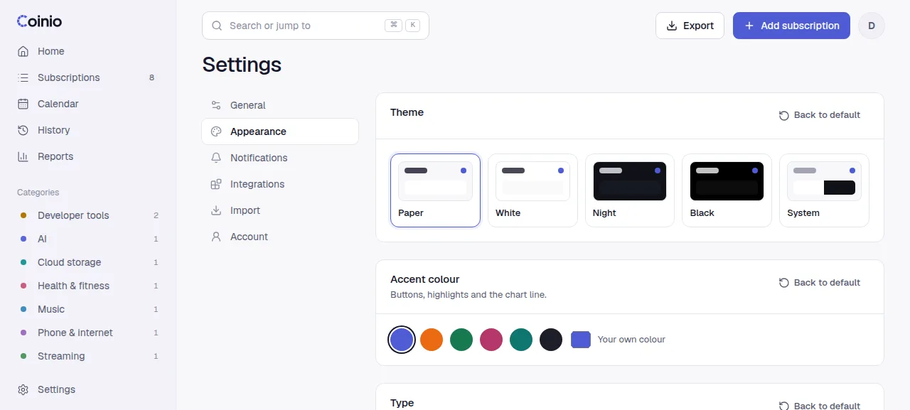
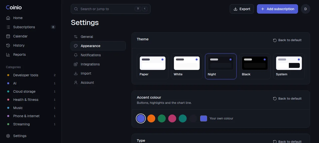
Theme and colour
- Theme: Paper (default), White, Night, Black, or System to follow your device. The account menu has a quick light/dark switch.
- Accent colour: buttons, highlights and the chart line. Pick a preset or your own colour.
- Category colours: the colour of each category in the breakdown and reports.
Type
Six font pairs, for headings and amounts and for text. Only the fonts of the pair you choose are downloaded.
| Name | Fonts |
|---|---|
| Refined (default) | Geist + Geist Mono |
| Editorial | Instrument Serif + Inter |
| Warm | Fraunces + Manrope |
| Technical | Space Grotesk + IBM Plex Mono |
| Bold | Bricolage Grotesque + Inter |
| System font | Your device's own font |
Layout and numbers
- Density: roomy or compact.
- Corner roundness: 0 to 20 px.
- Logo shape: circle or rounded square.
- Cents: small and raised, inline, or hidden.
- Show the original currency under converted amounts.
Dashboard cards
In Settings › Appearance › Dashboard cards, reorder the dashboard by dragging (or with the arrow buttons), and hide cards with the switch: Greeting, This month, Summary, Upcoming payments, Quick add, This week, Monthly breakdown, Recent activity, All subscriptions, and your own HTML cards.
On the dashboard itself, every card has a ⋯ menu (top right, shown on hover or focus) to move it up or down or hide it; HTML cards also have Edit card. A new HTML card is placed right below the greeting so you see it straight away.
Custom HTML cards
Add up to 20 cards with your own HTML: notes, links, an embedded widget. Each has a title, a height (80 to 1200 px) and up to 50,000 characters of HTML, with a live preview.
A card follows the light or dark theme (its text colour adapts and its background is transparent) and starts with your accent colour as --accent, so color: var(--accent) works inside it. Your own styles override these.
How cards are sealed
Each card runs in an iframe with sandbox="allow-scripts" and without allow-same-origin. Scripts in the card
run, but in a separate, anonymous origin: they cannot read your session cookie, call the Coinio API or see your
subscriptions. By default a card only knows what you wrote into it; to give it live numbers, turn on
Show my data to this card (below).
Deleting a card asks first; it cannot be undone.
Let a card read your data
Each HTML card has a Show my data to this card switch, off by default. Turning it on asks for confirmation: the card's code can then read your upcoming payments, amounts and totals, and could send them anywhere, so turn it on only for code you wrote or trust. Loading a theme file always turns it off on every card in that file.
When it is on, Coinio posts a read-only summary into the card with postMessage: once the card has loaded, again whenever your data changes, and whenever the card asks for it. The card still cannot call the API or change anything.
| Message | Direction | Shape |
|---|---|---|
coinio:data | Coinio → card | { type: 'coinio:data', version: 1, data } |
coinio:request-data | card → Coinio | { type: 'coinio:request-data' } (asks for a fresh coinio:data) |
data has the same shape as the widget endpoint (GET /api/widget):
base: your main currency code, for example"EUR".leftThisMonthMinor: what is still due this month, in hundredths ofbase(12999 means 129.99).monthlyAverageMinor: the monthly average of all active subscriptions, in hundredths.ratesStale:truewhen exchange rates are out of date and converted amounts are approximate.items: up to six due payments, overdue first. Each hassubscriptionId,name,dueDate(YYYY-MM-DD),amountMinorandcurrencyin the subscription's own currency,baseMinor(converted, ornullwithout a rate),daysLeft(negative when overdue),autoPay,variableAmount,reminderDaysandlogoPath.generatedAt: when the summary was made (ISO 8601).
A small card that shows the next payment:
<p id="next" style="margin:16px;font:500 15px system-ui">Loading…</p>
<script>
  const money = (minor, currency) =>
    new Intl.NumberFormat(undefined, { style: 'currency', currency }).format(minor / 100);
  addEventListener('message', (e) => {
    if (e.data?.type !== 'coinio:data') return;
    const next = e.data.data.items[0];
    document.getElementById('next').textContent = next
      ? `${next.name}: ${money(next.amountMinor, next.currency)} on ${next.dueDate}`
      : 'Nothing due.';
  });
  parent.postMessage({ type: 'coinio:request-data' }, '*');
</script>
Custom CSS
Up to 50,000 characters of CSS, applied live on top of everything. The whole interface reads its colours, sizes and fonts from CSS variables, so overriding a few is usually enough:
:root {
  --accent: #e5484d;
  --radius: 4px;
  --font-text: Georgia, serif;
}
Your CSS wins over the accent colour and corner settings above. Coinio does not download fonts for custom CSS: use a font installed on your devices, or one of the font pairs under Type (their fonts are only loaded while that pair is selected).
The editor lists the main variables with their current values: --bg, --card, --sunk, --line, --text, --text-2, --accent, --primary, --pos, --neg, --radius, --gap, --logo, --font-text, --font-display, --font-num. Click one to add it.
If your CSS hides the app
Add ?nocss to the address, for example https://coinio.example.com/settings/appearance?nocss. Coinio then loads without your custom CSS and HTML cards until the next full reload, so you can fix or clear the CSS.
Share a theme
Download theme saves all appearance settings, including custom CSS and HTML cards, as coinio-theme.json. Load theme applies such a file after asking first: it replaces your current appearance, including your HTML cards and custom CSS, and warns when the file brings its own CSS or HTML. Download your own theme first if you want to keep it. Values a file gets wrong fall back to the defaults instead of failing, so themes from older versions still load. Theme files never contain subscriptions or account data.